Estimated Reading Time: 7 minutes
User Interface (UI) design is much more than creating visually appealing screens. Every button, form, menu, and interactive component contributes to the overall experience users have with your product. Well-designed UI elements reduce friction, improve usability, and help users accomplish their goals with confidence.
Whether you’re designing a website, SaaS platform, mobile application, or enterprise system, understanding how UI elements work together is essential. In this guide, we’ll explore the core building blocks of modern interfaces and the best practices designers can follow to create intuitive digital experiences.
Why UI Elements Matter
Every interaction between a user and a digital product happens through UI elements. They guide navigation, communicate information, collect user input, and provide feedback. When these components are thoughtfully designed, users can complete tasks naturally without unnecessary confusion.
Poorly designed interfaces often lead to frustration, abandoned forms, higher support requests, and lower conversion rates. Investing time in refining UI elements helps improve both customer satisfaction and business performance.
Understanding the Core UI Components
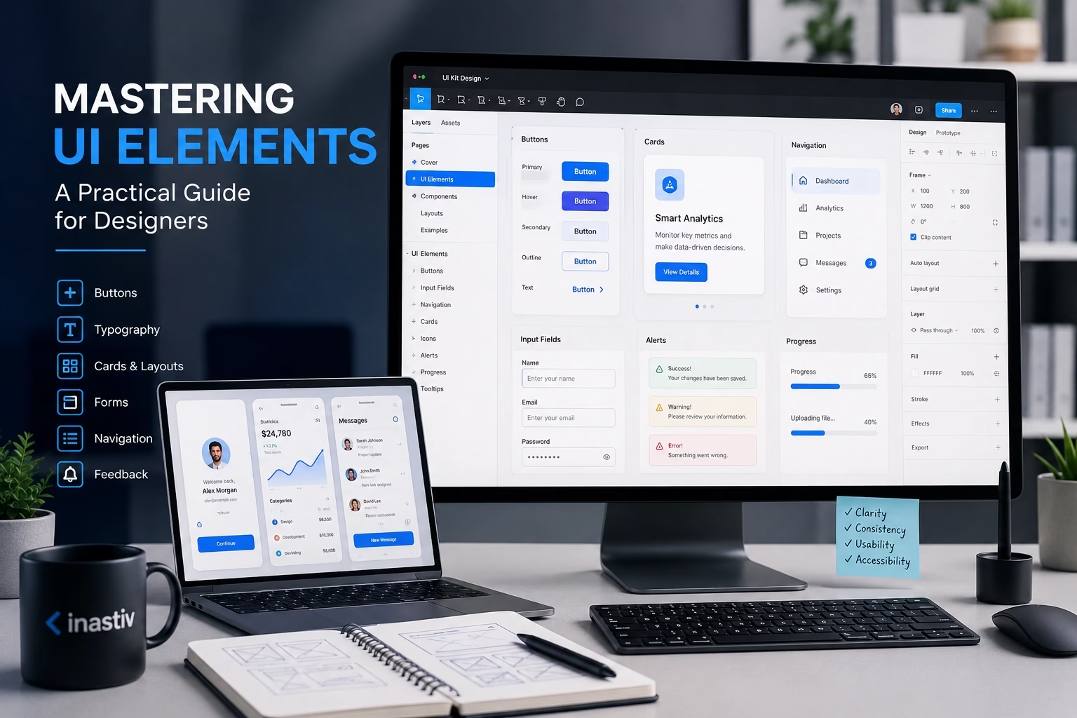
Modern digital products rely on a collection of reusable interface elements that work together to create a consistent user experience.
- Buttons
- Input fields
- Dropdown menus
- Navigation bars
- Cards
- Modals
- Tabs
- Accordions
- Icons
- Notifications
- Progress indicators
- Tooltips
Instead of designing every page independently, successful design teams build these components once and reuse them consistently throughout the product.
Buttons: The Gateway to User Actions
Buttons are among the most frequently used interface elements. They initiate actions such as submitting forms, downloading files, completing purchases, or navigating between pages.
Effective buttons should clearly communicate what will happen when clicked. Labels like Create Account, Download Report, or Book a Demo are far more informative than generic labels such as “Submit” or “Click Here.”
Designers should also establish clear visual hierarchy by defining primary, secondary, and tertiary button styles. Users should immediately recognize the most important action on every screen.
Design Forms That Feel Effortless
Forms are often where users make important decisions, whether registering for an account, requesting a quote, or completing a purchase. Small usability improvements can significantly increase completion rates.
Keep forms simple by asking only for information that is genuinely necessary. Organize related fields together, provide descriptive labels, and display helpful validation messages when errors occur.
On mobile devices, ensure input fields are large enough to tap comfortably and trigger the appropriate keyboard type for each field.
A great form feels like a conversation rather than an interrogation.
Create Navigation That Users Never Have to Think About
Navigation should help users move naturally through your product without requiring extra effort. Clear menus, logical page structures, and consistent placement all contribute to a better experience.
Whether you’re designing a corporate website or a complex dashboard, navigation should prioritize simplicity over creativity. Familiar patterns reduce the learning curve and help users find information faster.
- Keep menu labels concise.
- Limit unnecessary navigation levels.
- Highlight the active page.
- Provide clear calls to action.
Cards: Organizing Content Effectively
Cards have become one of the most popular layout components in modern interface design. They allow designers to present related information in a structured and visually digestible format.
A well-designed card typically includes:
- Title
- Supporting description
- Image or icon
- Primary action button
- Optional metadata
Cards work particularly well for dashboards, product listings, portfolios, blog posts, and analytics platforms.
Typography Shapes User Experience
Typography is often underestimated, yet it plays a critical role in readability and visual hierarchy. Users scan content before reading it, making typography one of the strongest tools for guiding attention.
Use a consistent heading structure throughout your interface:
- H1 for page titles
- H2 for major sections
- H3 for supporting topics
- Body text for detailed content
Generous spacing, readable font sizes, and consistent line height improve comprehension across all devices.
Design Systems Build Better Products
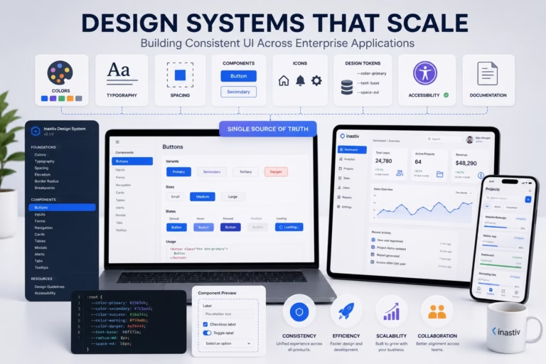
As products evolve, maintaining visual consistency becomes increasingly challenging. A design system solves this problem by providing a shared library of reusable components, design tokens, typography rules, colors, spacing guidelines, and interaction patterns.
Instead of redesigning components repeatedly, teams can focus on solving user problems while maintaining consistency across every screen.
Benefits of a design system include:
- Faster design workflows
- Improved collaboration between designers and developers
- Consistent user experience
- Simplified maintenance
- Scalable product growth
Accessibility Is Good Design
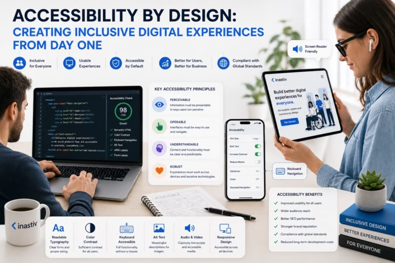
Accessible interfaces benefit everyone, not just users with disabilities. Designing with accessibility in mind leads to products that are easier to understand, navigate, and interact with.
Consider these accessibility best practices:
- Maintain sufficient color contrast.
- Support keyboard navigation.
- Use descriptive labels for interactive elements.
- Provide alternative text for meaningful images.
- Ensure focus indicators remain visible.
- Avoid relying solely on color to communicate information.
Accessibility should be part of the design process from the beginning rather than an afterthought.
Common UI Design Mistakes
Even experienced designers occasionally introduce unnecessary complexity. Being aware of common mistakes helps create cleaner, more effective interfaces.
- Too many competing call-to-action buttons.
- Inconsistent spacing between components.
- Poor color contrast.
- Overusing animations.
- Small touch targets on mobile devices.
- Confusing navigation structures.
- Inconsistent icon styles.
- Long, complicated forms.
Regular usability testing is one of the best ways to identify these issues before your users do.
Final Thoughts
Mastering UI elements isn’t about memorizing component libraries or following design trends. It’s about understanding how every interaction contributes to the overall user experience.
By focusing on clarity, consistency, accessibility, and usability, designers can build interfaces that are not only visually appealing but also intuitive, efficient, and enjoyable to use.
As digital products continue to evolve, the fundamentals of great interface design remain unchanged: make interactions simple, communicate clearly, and always design with the user in mind.
About Inastiv
At Inastiv, we design and develop modern digital solutions that combine exceptional user experiences with scalable technology. From UI/UX design and responsive websites to enterprise platforms and custom software development, our team helps businesses build products that are intuitive, high-performing, and ready for growth.